Principal
Dan Grey
Location
London, United Kingdom
Designed from
London, United Kingdom
Category
Retail
Service(s)
(001) Brand Strategy
(002) Visual Identity
Bespoke
Packaging Design
Summary
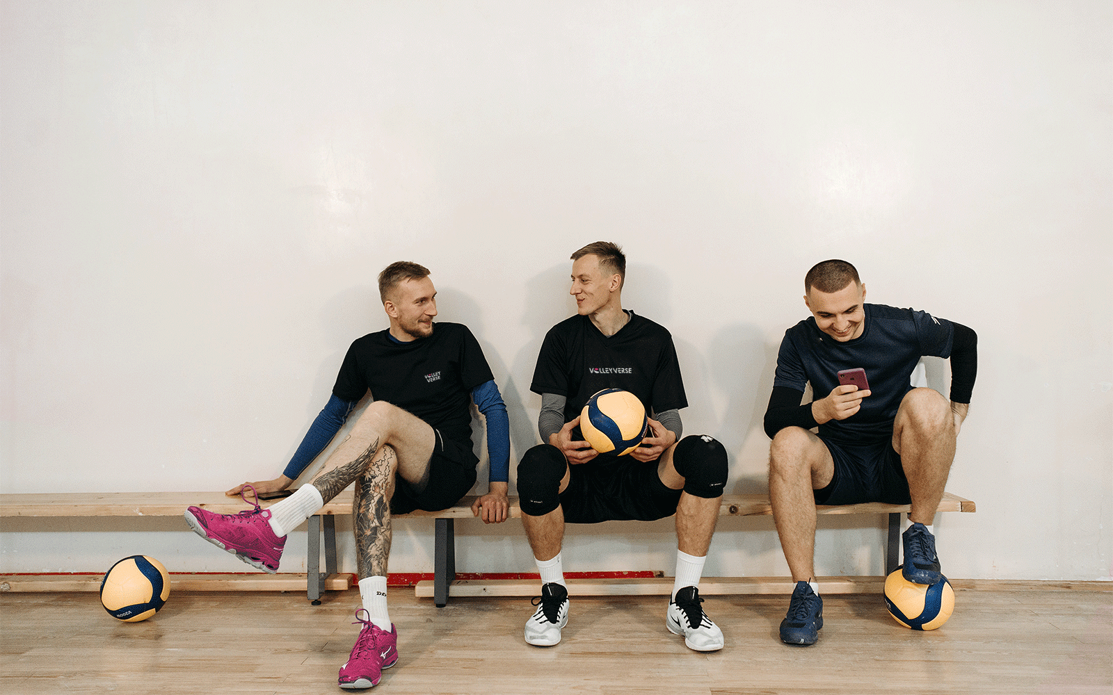
This London-based enterprise, under the guidance of the former coach and visionary, Dan Grey, embodies more than just volleyball gear—it crafts a global community defined by fair trade and female empowerment, daring to challenge the status quo in a world that often privileges scale over ethics and profit over planetary wellbeing.
The athletic wear industry experienced explosive growth in the last two decades. However, even though the industry is highly segmented by sports, models and prices, it is still dominated by a few large companies — for instance, the top 10 companies control no less than 70% of the global market ¹, leaving little room for consumers to make ethical choices.
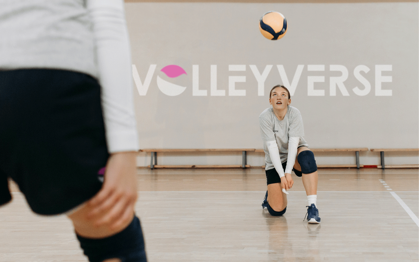
With the rise of TikTok, the retired volleyball coach, Dan Grey, saw a gap in the market. Dan noticed that, although there was a large audience around volleyball, there was nothing but a hashtag uniting them. So he decided to step in. In the heart of London, Dan created Volleyverse, an independent news channel to connect and inspire fans and players.
But the more Dan increased his efforts towards his news channel, the more he wanted to make a difference. That was when he invited Faceless to help Volleyverse pivot from a news source to a mission-driven company with the ambition to make volleyball the number one women's sport in the world through player and fan services.
1


In the following weeks, as the grandiosity of London imposed itself upon us, the idea started to settle in. As a company established before our involvement, our work was not to find a viable audience but to convert the present followers into customers. So, as pizza boxes pilled up, we dived into the investigation of "community".
Volleyverse's following was primarily composed of young students. When we speak with a younger audience, it is important to notice that the buying decision will ultimately come from their parents. However, after long meetings, research and speculation about their consumption habits, we were confident in VV's offering.
Whether talking to players, fans, or parents, our best chance to compete with major companies was by publicly stating that we stand against them. But while reading The Social Integrative Meaning of Sport in The Human Kinetics Journal, we had the idea to wrap the global volleyball community in its practice of the sport.
2
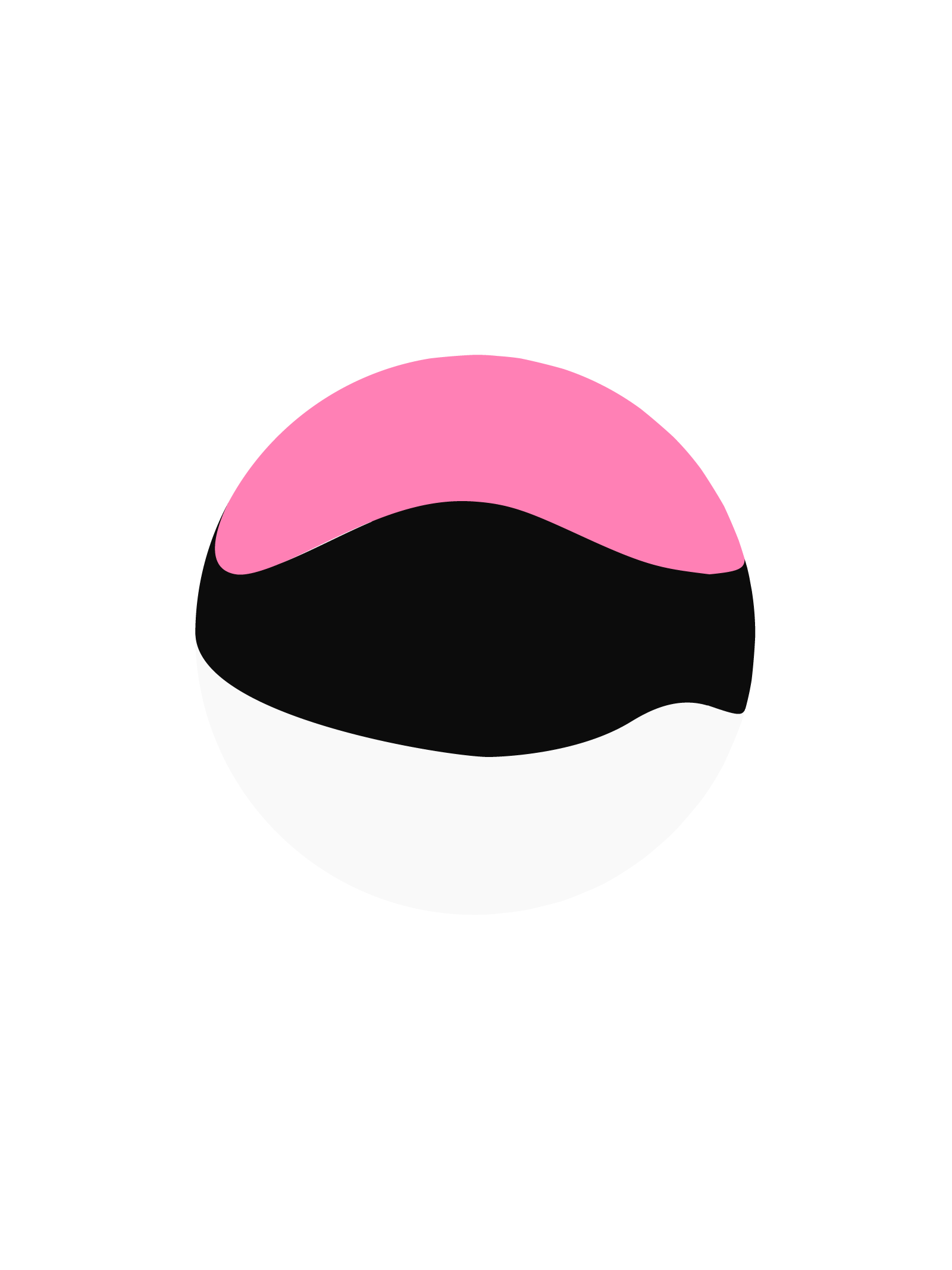
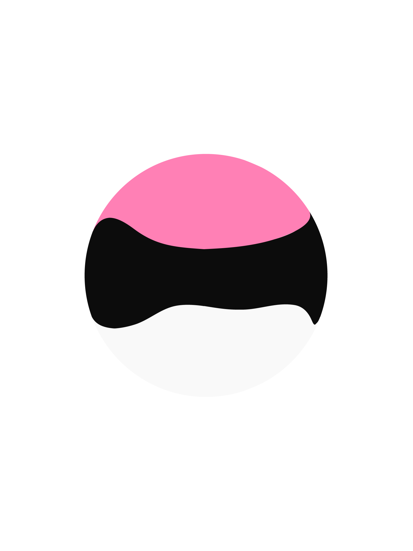
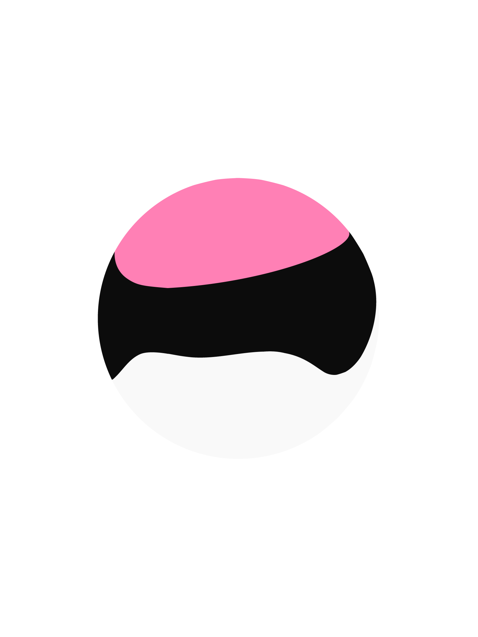
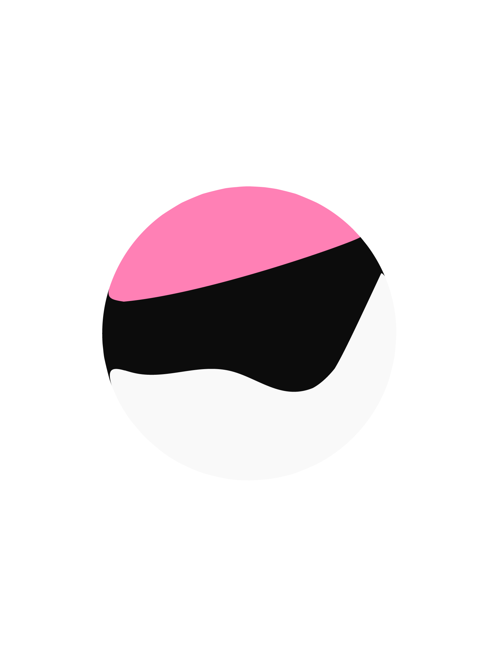
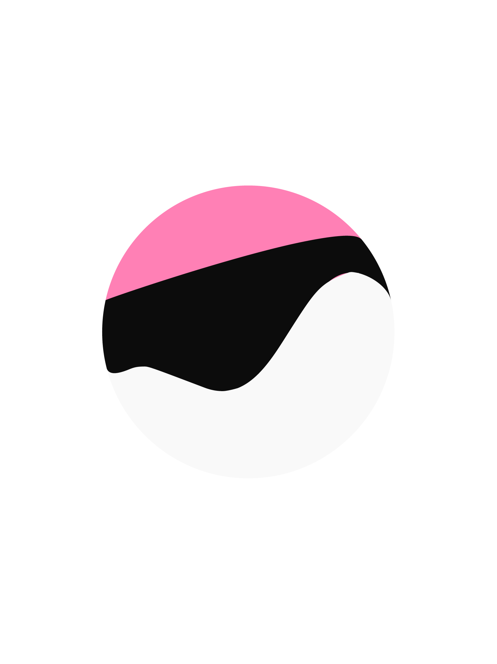
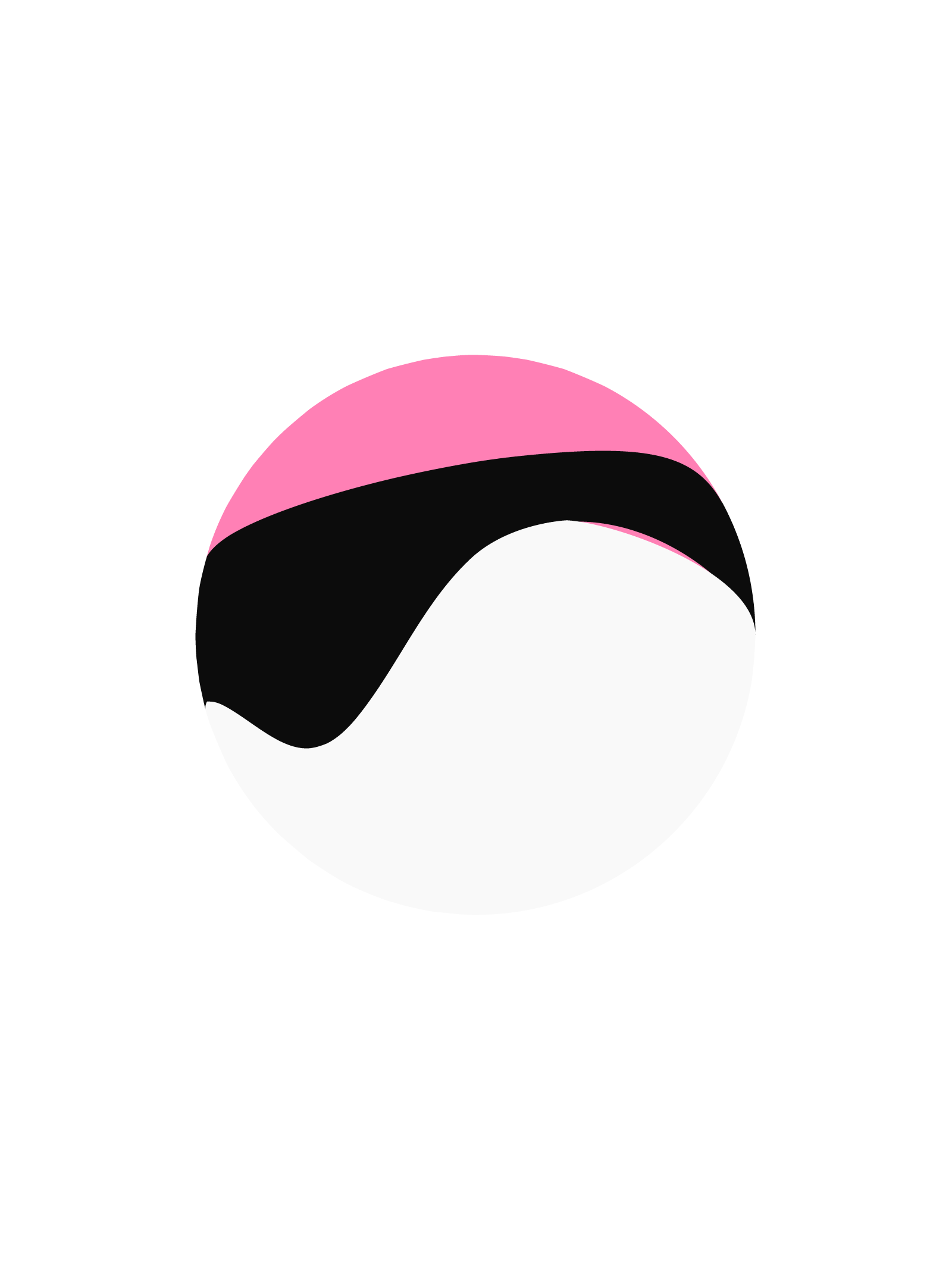
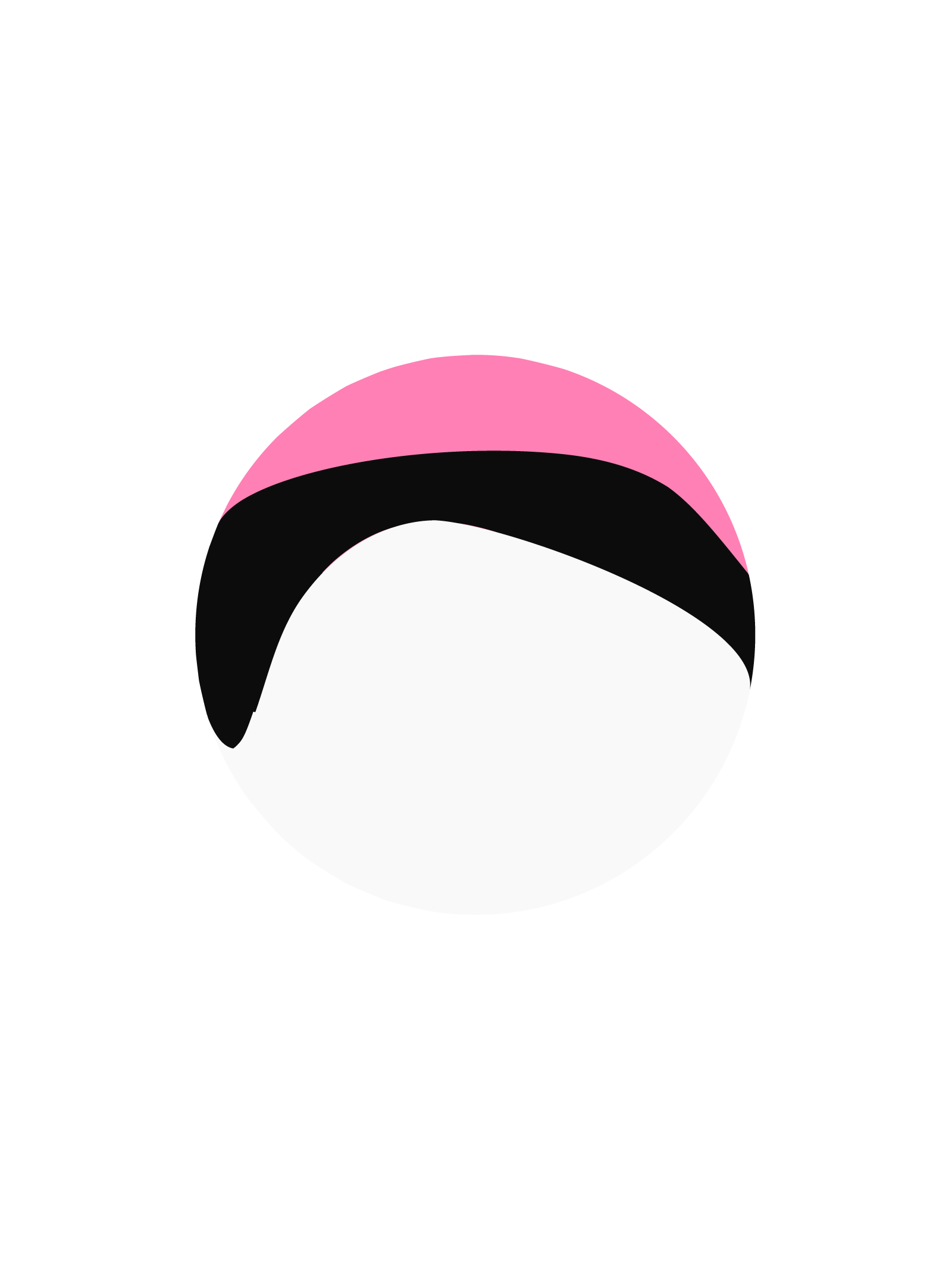
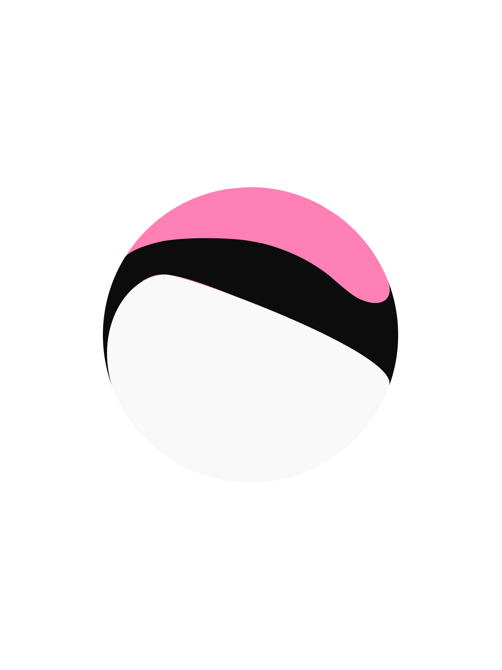
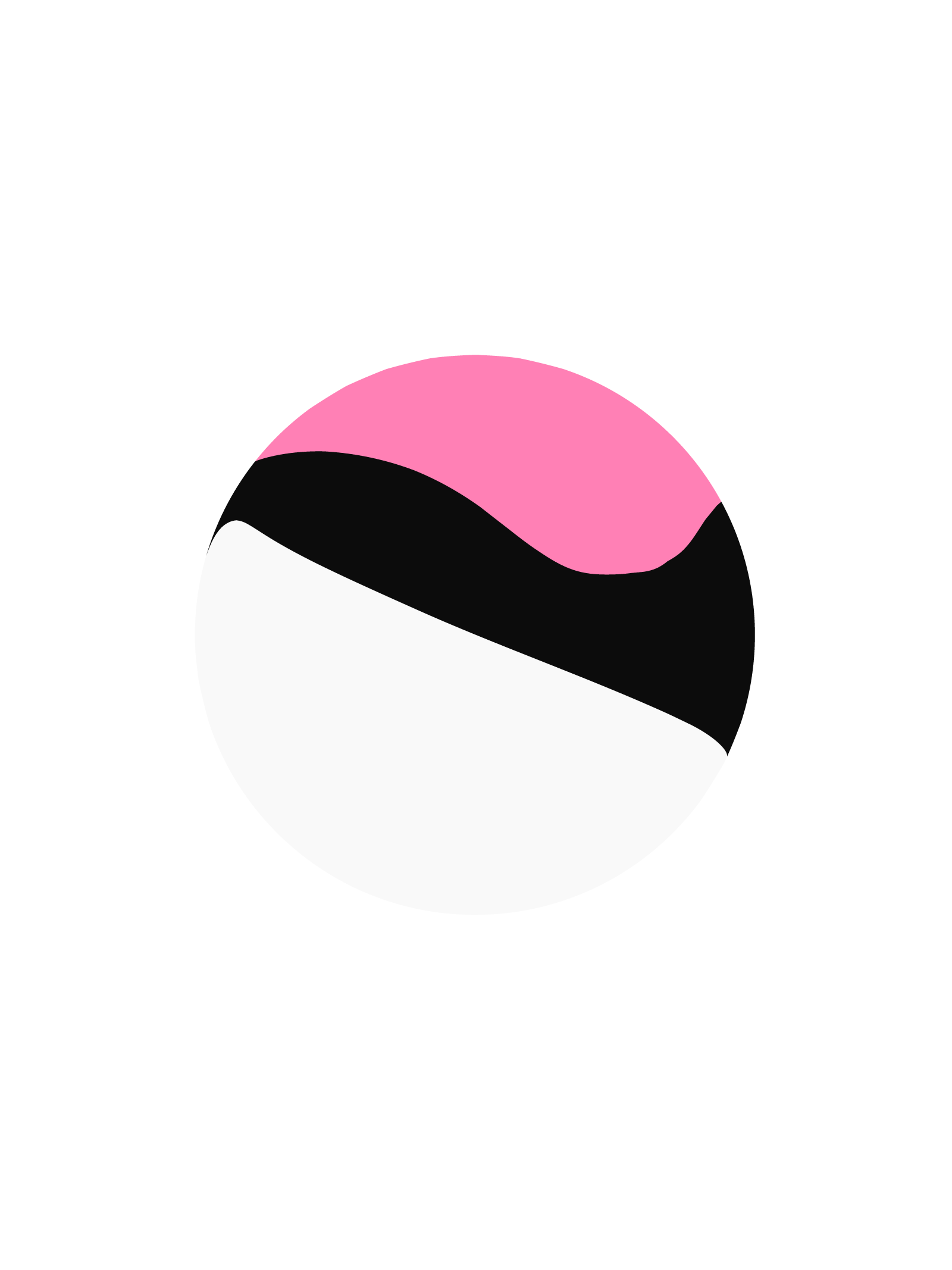
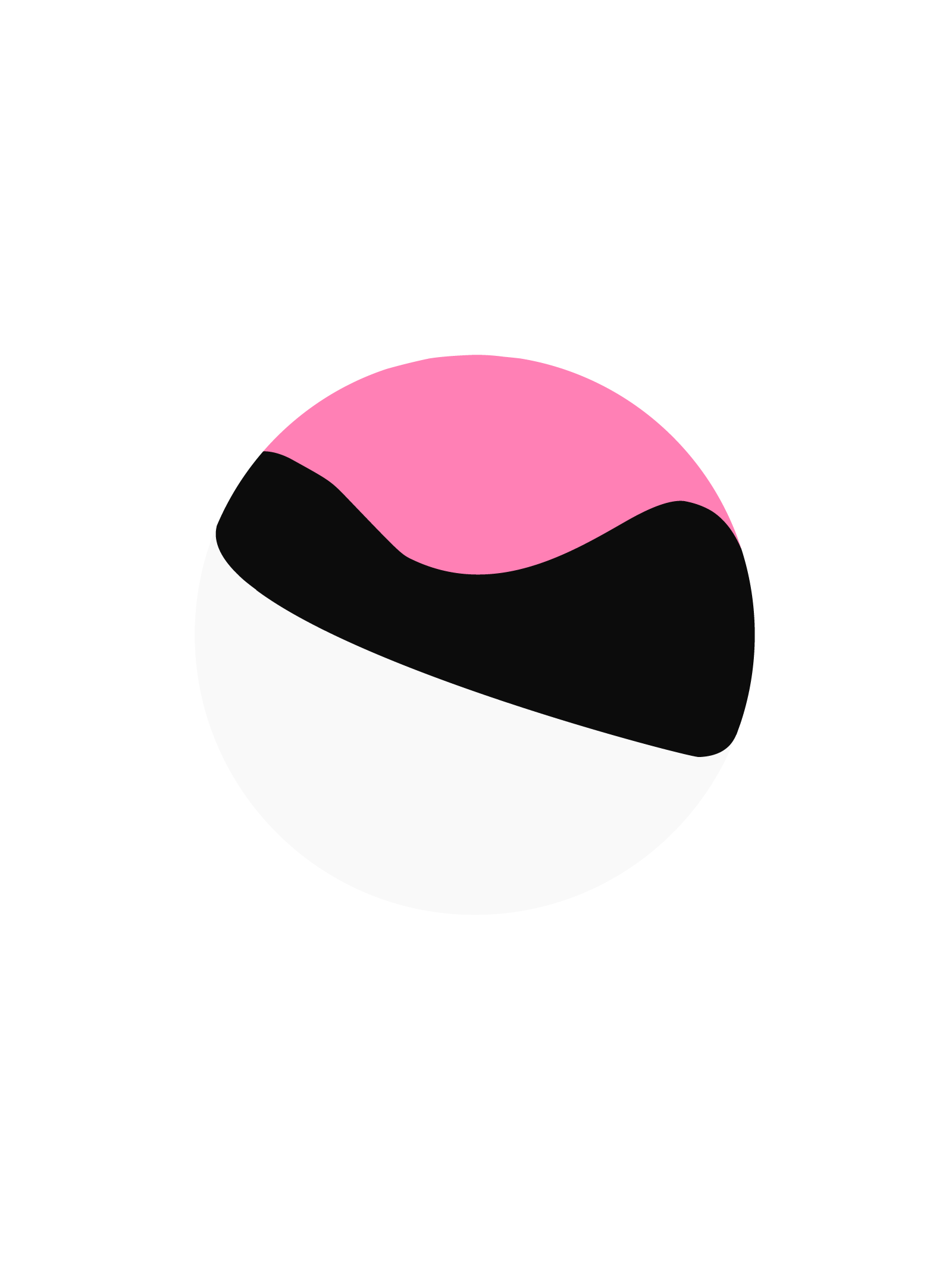
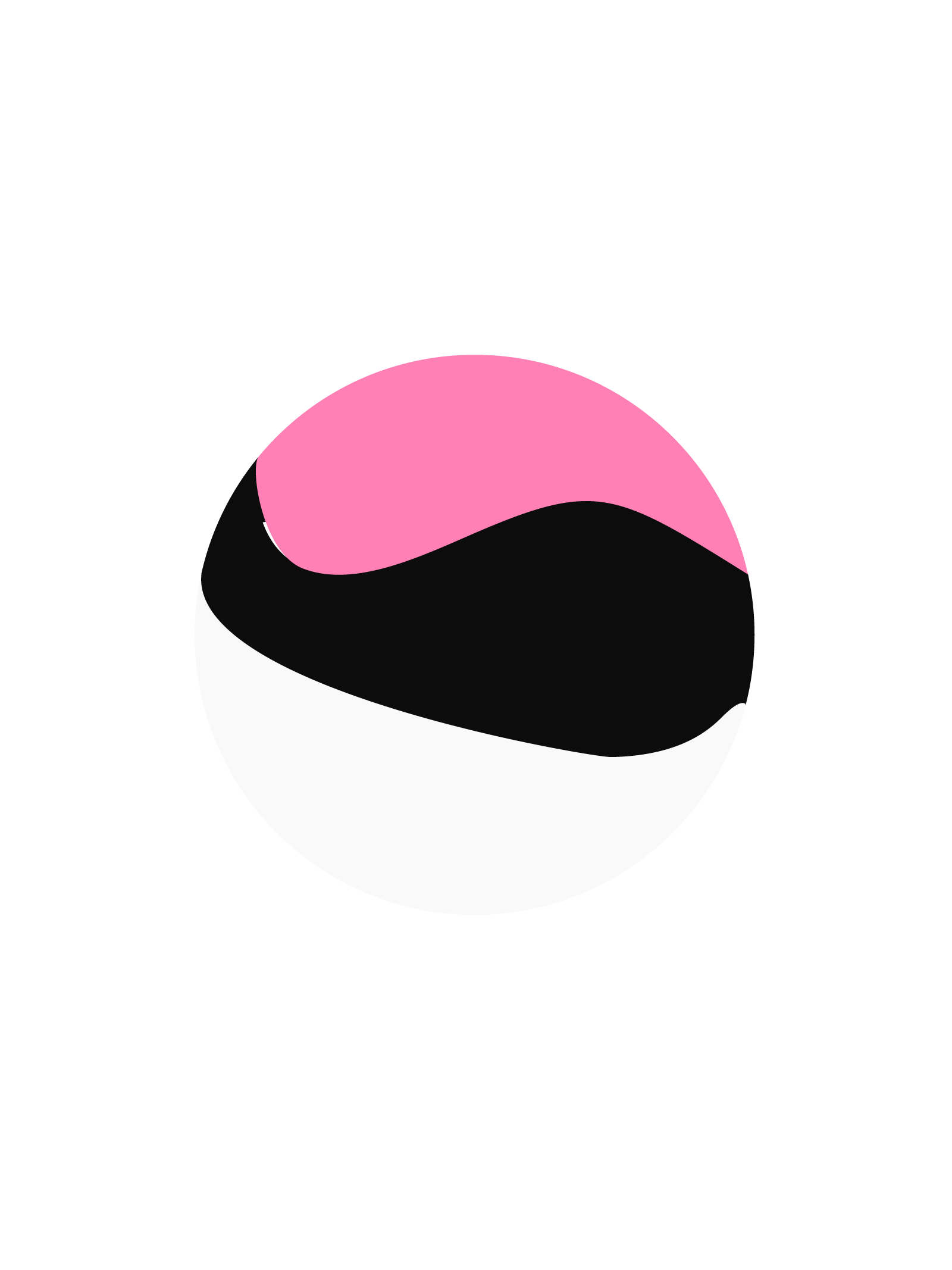
Whilst the globe represents volleyball as a community beyond borders, we realigned the data collected from a study that presents a kinematic analysis of volleyball athletes' movements and speed during attacks with various types of take-off to inject the nature of the sport into the identity. Finally, we combined these concepts on a 3D sphere, creating a symbol that works independently or within the logotype.
In honour of the fact that volleyball is one of the few sports predominantly played by women, we picked an energetic pink hue to represent the brand. Furthermore, we chose a single colour that is easy to remember when you first see it through advertising, easy to see when the packaging is on a shelf, easy to describe when mentioning the brand to a friend or relative, and easy to differentiate from the competition.
For this project, we chose a typeface that would seem modern and youthful for the players and, at the same time, look safe and grounded for their parents. The narrow "L" and odd angles of the "S" give it an edge that appeals to the youth, but the bold weight and consistent touching of the baseline reassure wary parents. The next step was customising some "E"s and the "R" to convey the idea of speed and movement.
3
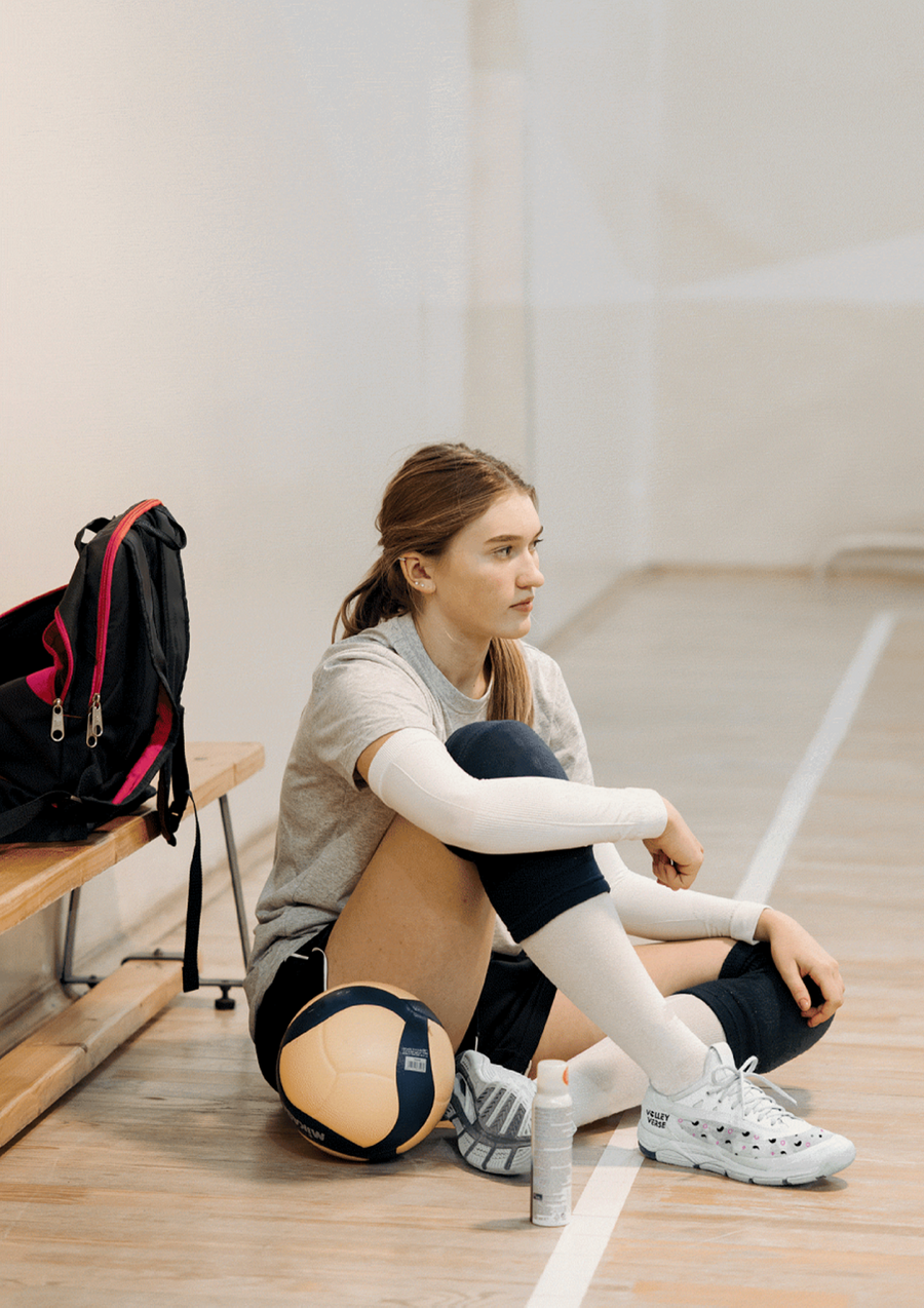

Whilst Volleyverse aims to compete in the sportswear scenario, the first step of its business plan was to create "an online shop that supplies high-quality products for players and fans alike". So we decided that the most important asset we could design was their packaging.
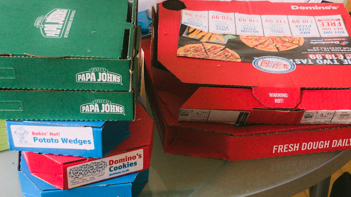
Our goal was to create something that would increase brand awareness by getting customers excited to share their orders on social media. We needed something fun whilst keeping the promise to be respectful of the planet. So kept the cardboard as is but made it as pink as possible.
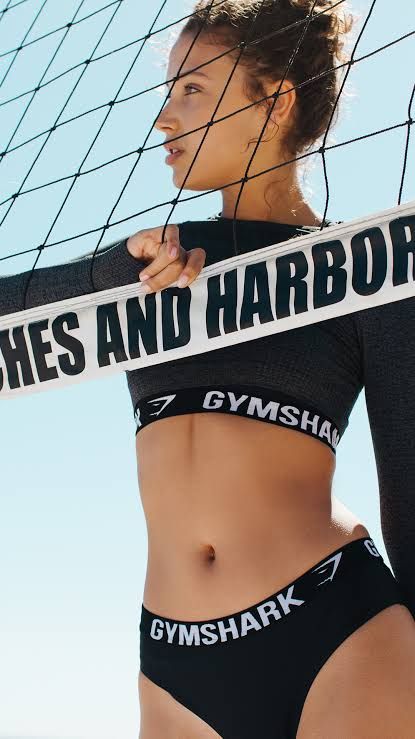
The Volleyverse customer is young but somewhat sober. Considering the next step of their business plan, it was time to develop an identity for their branded apparel. Although pink is essential for the brand's recognition, its secondary colour, black, was the main choice this time.
4
To engage Volleyverse's followers around their mission, we created an immersive platform that juxtaposes their ambitious attitude and environmental responsibility.
Envisioning a streamlined sales process and considering Dan's familiarity with the platform, we built this customised solution on Shopify.
The platform will be a home for their news and a playground for Volleyverse's current and future endeavours.
***
“Thank you for all your dedication, your patient approach and your end product, which I think is fantastic. I genuinely feel that you have delivered exceptional value!”
— Dan Grey, Founder
Next Week Club
Business, Brand and Behaviour